The founder of Luxigon, creators of visualisations for some of the world’s
most innovative architects, tells Kim Megson about the power of drawing
and why he’s fighting for more ethnic diversity in renderings
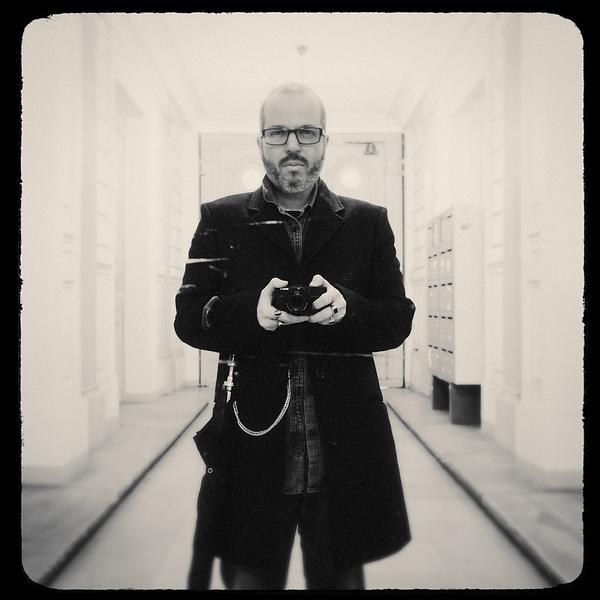
Eric de Broches des Combes founded Luxigon in 2006
How did you begin making visualisations? It started when I was studying at the School of Architecture in Marseille, France, and I needed a part-time job. I didn’t want to work in a supermarket or do manual work because I was a bit lazy! But I could draw well, so I started doing drawings for students and teachers. Then I opened a little drawing shop. I thought it was a temporary moment in my life, because this job didn’t exist at the time, however, it slowly but surely became my career.
Can you describe how Luxigon developed? I was enjoying the work, and the advances in computer technology helped me a lot – before then I was doing everything by hand. The internet also created new opportunities.
I’m a curious person, and I decided I wanted to explore architecture with the best architects – the likes of Rem Koolhaas and Winy Maas who were becoming famous in the 90s. So I moved to Paris, opened an office and then at some point we had a call from Koolhaas’ office at OMA. We said: ‘Oh my God, we must have done something good!’ From there, everything took off.
Was it much of a learning curve in those early days? We soon realised there’s a level of excellence expected when you’re working with top architects. We worked night after night and did our drawings again and again. These days it’s easier because we instantly know what’s possible, what’s not possible and how to best use the computers, so there’s more of a plan. Mind you, there are still projects where we don’t sleep for a couple of nights and we need a lot of coffee and determination!
Has your process changed much? I would say that part of the style that we have now, developed as a result of the limitations I had with the computer when I started. It used to take hours and hours just to draw realistic glass, so I learned to kind of fake it with Photoshop. That led to our 3D style, a lot of which is created by us rather than relying on software. That means it’s more pure, and not such a product of the technology of its time.
What do you enjoy about creating visualisations? You know, I was an architect, I designed a couple of buildings and I’m still registered, but I love doing visualisations so much more. I think drawings are even more influential than real buildings, because a drawing is the simplest, most genuine form of architecture. It demonstrates what the architect had in their mind. The purity of the vision is in the drawing because there’s no cost, no gravity, no politics or problems surrounding it. When a design is turned into a real building, it’s always somehow a bastardisation of the original vision.
Is there ever an issue with people liking the renderings more that the finished building? A drawing is like a knife. You can use it for good or you can use it for bad. The problem is more with the viewer than with the person who created the rendering. It’s about interpretation, because I don’t believe that architecture is getting better – many new buildings look like cakes – but the renderings are definitely becoming more beautiful.
Architecture is an act of convincing. It’s a very political act and visualisations are part of the whole vocabulary. A rendering is a guide, and if it’s used correctly by someone with a conscience, it should be a good way to illustrate their vision. The problem is that the people who are looking at drawings know nothing about what goes into architecture. They don’t want to read plans or sections. They just want to see a picture of people wandering around a building with balloons and happy kids. This is where simplification comes from. Renderings are not a replacement for detailed plans, they just provide an illustration.
Do you think you have a responsibility to reflect reality in your visualisations? Drawing is a very powerful tool, which means you have to be careful. Our aim is, of course, to convince people [about a building], but it’s our philosophy that we won’t lie. I will push something to an extreme, but I will not lie. Anything depicted in the rendering should be something that could happen for real. If I don’t feel it is, I’ll discuss that with the client.
Having said that, it’s really important that people understand that it’s not a picture, but an illustration. A rendering is obviously not exactly like the real world. That’s intentional. A lot of our images are populated with stars like Brad Pitt and Angelina Jolie. I mean, why would Angelina Jolie be in a hospital in the suburbs of Paris?
Campaigners have criticised the lack of diversity among the people represented in visualisations. How is it decided who populates the worlds that you’re creating? There’s sometimes a preconceived idea about who should and shouldn’t appear in renderings from the people who commission the images, which doesn’t correspond at all to the real world. For example, we sometimes receive detailed ethnic demographic proportions to follow – for example 12 per cent black people, 24 per cent Asian people – which I think is stupid.
We’re also often asked to only include young, healthy people, so that even hospitals are only populated with people who look so good you wouldn’t know they’re ill. There are no fat kids. Everybody seems to be ecstatic about being in the building, whatever it is; it could be a power plant. They’re obviously not real people, because they in no way correspond to the living.
But increasingly people want realistic images, not only in the realism of the materials presented, but also in terms of population as well. And I think that’s a very interesting topic the visualisation world is still not covering. We have technology that can make the image very realistic if you want, but it’s up to you to make it socially realistic. So yeah, when somebody is telling me ‘don’t put too many black people in the rendering,’ I say, ‘Why the hell would I not put black people in? There are lots of black people living in this area, so let’s represent that.’
I’m fighting for more diversity, but I’m even fighting to represent the idea that the sky is grey sometimes. We had an experience recently with a guy from Beijing who asked us to do extremely realistic images. He said, ‘I want it to be exactly like a real-life picture...except you remove all the fog and the pollution.’ Those battles are the fun of this job. I’m not just here to please the masters.
When you’re visualising a really abstract, conceptual structure, how do you begin to realise that? You have to understand what it’s all about first. If you want to convey the idea that it’s a sci-fi building, then I would use all the sci-fi code to make it look like it’s from the world of Blade Runner. You give me a cube, and I can make it look like it’s from Tron, or I can make the roughest draft render in the world. It really depends on the will of the architect, and based on that you bring a lot of your own ideas and references to make that happen. Most of the work involved in making an image is in the time spent discussing it, rather than sitting at the computer. Sometimes we’re some way off on the interpretation we come up with, sometimes we’re spot on. Sometimes we end up bringing in something that the project didn’t have at the beginning.
Can you suggest design changes to the architects? We have a legitimacy now because we’ve been doing this a long time, so they listen to us more than in the past. We may suggest the best angle to showcase the building, or suggest making an image that’s more rough and risky. Sometimes we even suggest a new façade or a new structure. We’re all architects, and we consider ourselves to be doing architecture rather than drawing.
Which architects do you particularly enjoy working with? Joshua Prince-Ramus and REX are fantastic. We’re the same generation and we’ve been working together for 15 years. I’m sure he’ll win the Pritzker in the next five years. It’s the same for the Danish firm COBE. I love MVRDV too; Winy Maas is like a Jedi master of architecture and they’re not afraid to experiment. But I’m proud of my relationship with most of the studios we’re working with. My early Machiavellian plan to speak with the world’s best architects actually worked.
Diversity in renderings The debate surrounding diversity in renderings has grown in recent years, as online databases of ‘render people’ – cut-out characters who can populate the worlds created by visualisation teams – have become more popular.
The early databases originated in Scandinavia, and as a result the majority of people represented were from nations with predominantly Caucasian populations. According to campaigners, this has limited the diversity represented in renderings.
To counter this, new databases are being established to provide a broader selection of render people. These include Nonscandinavia, Escalalatina and Just Nøt The Same.
Rose Florian and Kordae Henry, creative directors of the latter, have said their mission is to create a digital catalogue of the “misrepresented, under-acknowledged and otherised populations that are so absent in traditional design imagery.”
They argue that as a representation of reality, an image “has the power to inspire us, limit us, lift us and oppress us” and can shape “not only how we see ourselves in the present, but also define the limits of what we can reach in the future.”
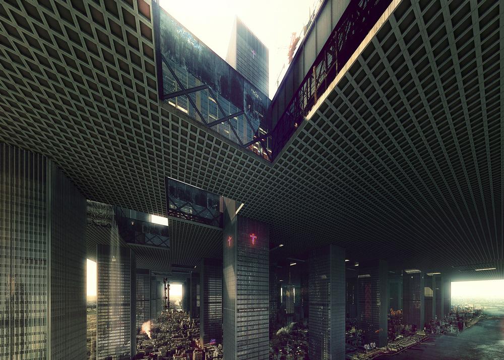
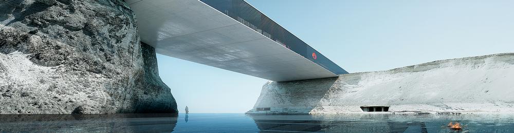
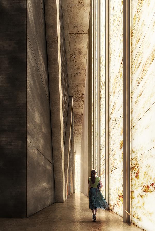
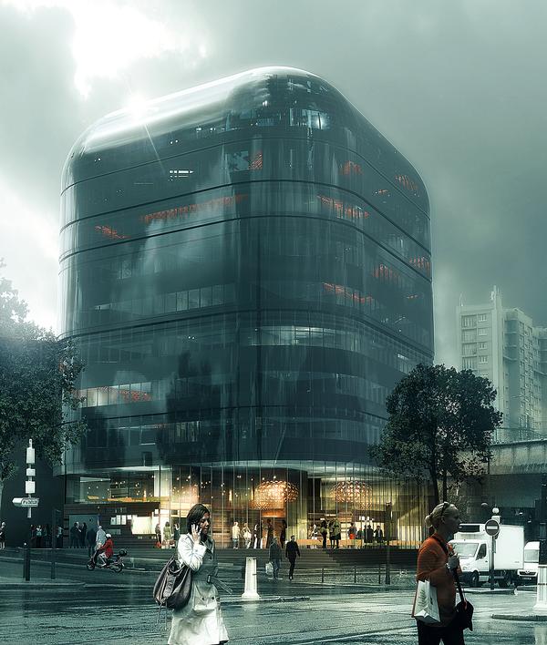
Luxigon created the renderings for REX’s Perelman Performing Arts Center at the WTC, New York
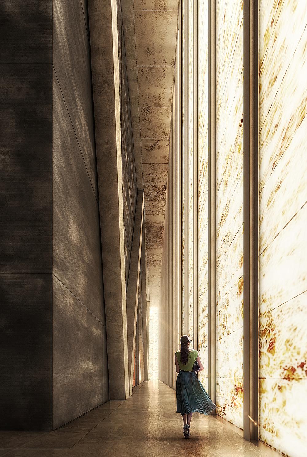
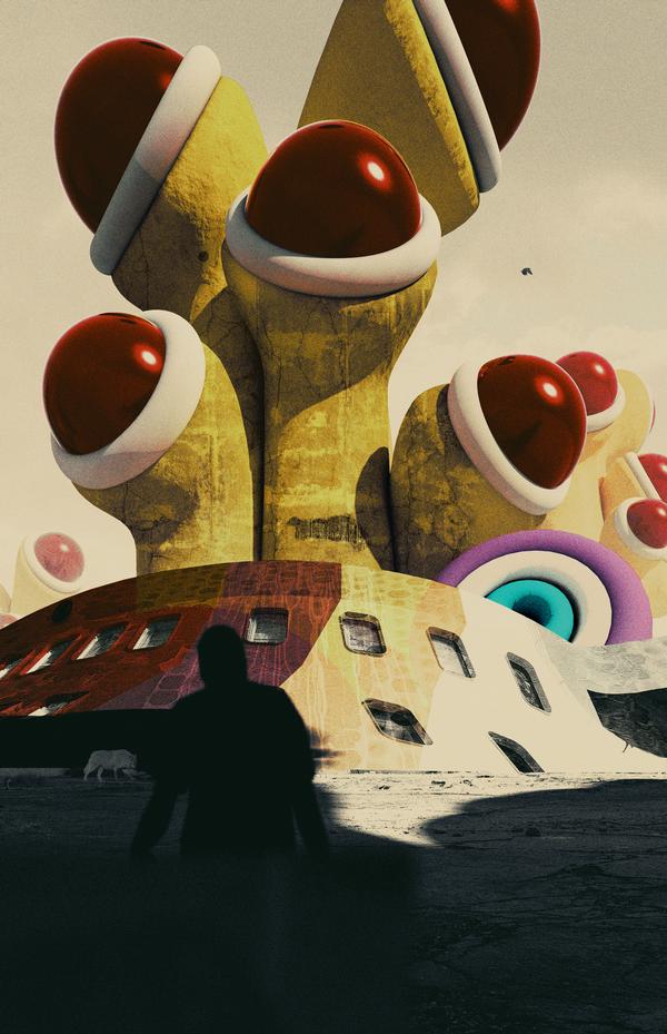
Eva Tucek’s fantastical designs for Blank Space’s Fairy Tales architecture competition, visualised by Eric de Broches des Combes
The founder of Luxigon, creators of visualisations for some of the world’s
most innovative architects, tells Kim Megson about the power of drawing
and why he’s fighting for more ethnic diversity in renderings
Kim Megson
Eric de Broches des Combes founded Luxigon in 2006
Luxigon created the renderings for REX’s Perelman Performing Arts Center at the WTC, New York
Eva Tucek’s fantastical designs for Blank Space’s Fairy Tales architecture competition, visualised by Eric de Broches des Combes
How did you begin making visualisations? It started when I was studying at the School of Architecture in Marseille, France, and I needed a part-time job. I didn’t want to work in a supermarket or do manual work because I was a bit lazy! But I could draw well, so I started doing drawings for students and teachers. Then I opened a little drawing shop. I thought it was a temporary moment in my life, because this job didn’t exist at the time, however, it slowly but surely became my career.
Can you describe how Luxigon developed? I was enjoying the work, and the advances in computer technology helped me a lot – before then I was doing everything by hand. The internet also created new opportunities.
I’m a curious person, and I decided I wanted to explore architecture with the best architects – the likes of Rem Koolhaas and Winy Maas who were becoming famous in the 90s. So I moved to Paris, opened an office and then at some point we had a call from Koolhaas’ office at OMA. We said: ‘Oh my God, we must have done something good!’ From there, everything took off.
Was it much of a learning curve in those early days? We soon realised there’s a level of excellence expected when you’re working with top architects. We worked night after night and did our drawings again and again. These days it’s easier because we instantly know what’s possible, what’s not possible and how to best use the computers, so there’s more of a plan. Mind you, there are still projects where we don’t sleep for a couple of nights and we need a lot of coffee and determination!
Has your process changed much? I would say that part of the style that we have now, developed as a result of the limitations I had with the computer when I started. It used to take hours and hours just to draw realistic glass, so I learned to kind of fake it with Photoshop. That led to our 3D style, a lot of which is created by us rather than relying on software. That means it’s more pure, and not such a product of the technology of its time.
What do you enjoy about creating visualisations? You know, I was an architect, I designed a couple of buildings and I’m still registered, but I love doing visualisations so much more. I think drawings are even more influential than real buildings, because a drawing is the simplest, most genuine form of architecture. It demonstrates what the architect had in their mind. The purity of the vision is in the drawing because there’s no cost, no gravity, no politics or problems surrounding it. When a design is turned into a real building, it’s always somehow a bastardisation of the original vision.
Is there ever an issue with people liking the renderings more that the finished building? A drawing is like a knife. You can use it for good or you can use it for bad. The problem is more with the viewer than with the person who created the rendering. It’s about interpretation, because I don’t believe that architecture is getting better – many new buildings look like cakes – but the renderings are definitely becoming more beautiful.
Architecture is an act of convincing. It’s a very political act and visualisations are part of the whole vocabulary. A rendering is a guide, and if it’s used correctly by someone with a conscience, it should be a good way to illustrate their vision. The problem is that the people who are looking at drawings know nothing about what goes into architecture. They don’t want to read plans or sections. They just want to see a picture of people wandering around a building with balloons and happy kids. This is where simplification comes from. Renderings are not a replacement for detailed plans, they just provide an illustration.
Do you think you have a responsibility to reflect reality in your visualisations? Drawing is a very powerful tool, which means you have to be careful. Our aim is, of course, to convince people [about a building], but it’s our philosophy that we won’t lie. I will push something to an extreme, but I will not lie. Anything depicted in the rendering should be something that could happen for real. If I don’t feel it is, I’ll discuss that with the client.
Having said that, it’s really important that people understand that it’s not a picture, but an illustration. A rendering is obviously not exactly like the real world. That’s intentional. A lot of our images are populated with stars like Brad Pitt and Angelina Jolie. I mean, why would Angelina Jolie be in a hospital in the suburbs of Paris?
Campaigners have criticised the lack of diversity among the people represented in visualisations. How is it decided who populates the worlds that you’re creating? There’s sometimes a preconceived idea about who should and shouldn’t appear in renderings from the people who commission the images, which doesn’t correspond at all to the real world. For example, we sometimes receive detailed ethnic demographic proportions to follow – for example 12 per cent black people, 24 per cent Asian people – which I think is stupid.
We’re also often asked to only include young, healthy people, so that even hospitals are only populated with people who look so good you wouldn’t know they’re ill. There are no fat kids. Everybody seems to be ecstatic about being in the building, whatever it is; it could be a power plant. They’re obviously not real people, because they in no way correspond to the living.
But increasingly people want realistic images, not only in the realism of the materials presented, but also in terms of population as well. And I think that’s a very interesting topic the visualisation world is still not covering. We have technology that can make the image very realistic if you want, but it’s up to you to make it socially realistic. So yeah, when somebody is telling me ‘don’t put too many black people in the rendering,’ I say, ‘Why the hell would I not put black people in? There are lots of black people living in this area, so let’s represent that.’
I’m fighting for more diversity, but I’m even fighting to represent the idea that the sky is grey sometimes. We had an experience recently with a guy from Beijing who asked us to do extremely realistic images. He said, ‘I want it to be exactly like a real-life picture...except you remove all the fog and the pollution.’ Those battles are the fun of this job. I’m not just here to please the masters.
When you’re visualising a really abstract, conceptual structure, how do you begin to realise that? You have to understand what it’s all about first. If you want to convey the idea that it’s a sci-fi building, then I would use all the sci-fi code to make it look like it’s from the world of Blade Runner. You give me a cube, and I can make it look like it’s from Tron, or I can make the roughest draft render in the world. It really depends on the will of the architect, and based on that you bring a lot of your own ideas and references to make that happen. Most of the work involved in making an image is in the time spent discussing it, rather than sitting at the computer. Sometimes we’re some way off on the interpretation we come up with, sometimes we’re spot on. Sometimes we end up bringing in something that the project didn’t have at the beginning.
Can you suggest design changes to the architects? We have a legitimacy now because we’ve been doing this a long time, so they listen to us more than in the past. We may suggest the best angle to showcase the building, or suggest making an image that’s more rough and risky. Sometimes we even suggest a new façade or a new structure. We’re all architects, and we consider ourselves to be doing architecture rather than drawing.
Which architects do you particularly enjoy working with? Joshua Prince-Ramus and REX are fantastic. We’re the same generation and we’ve been working together for 15 years. I’m sure he’ll win the Pritzker in the next five years. It’s the same for the Danish firm COBE. I love MVRDV too; Winy Maas is like a Jedi master of architecture and they’re not afraid to experiment. But I’m proud of my relationship with most of the studios we’re working with. My early Machiavellian plan to speak with the world’s best architects actually worked.
Diversity in renderings The debate surrounding diversity in renderings has grown in recent years, as online databases of ‘render people’ – cut-out characters who can populate the worlds created by visualisation teams – have become more popular.
The early databases originated in Scandinavia, and as a result the majority of people represented were from nations with predominantly Caucasian populations. According to campaigners, this has limited the diversity represented in renderings.
To counter this, new databases are being established to provide a broader selection of render people. These include Nonscandinavia, Escalalatina and Just Nøt The Same.
Rose Florian and Kordae Henry, creative directors of the latter, have said their mission is to create a digital catalogue of the “misrepresented, under-acknowledged and otherised populations that are so absent in traditional design imagery.”
They argue that as a representation of reality, an image “has the power to inspire us, limit us, lift us and oppress us” and can shape “not only how we see ourselves in the present, but also define the limits of what we can reach in the future.”