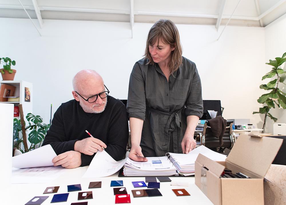
MacLennan began working on The Standard library project in February 2019
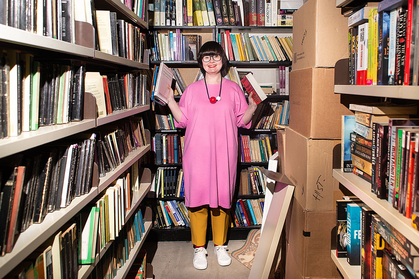
Carrie MacLennan
Curator, writer and artist
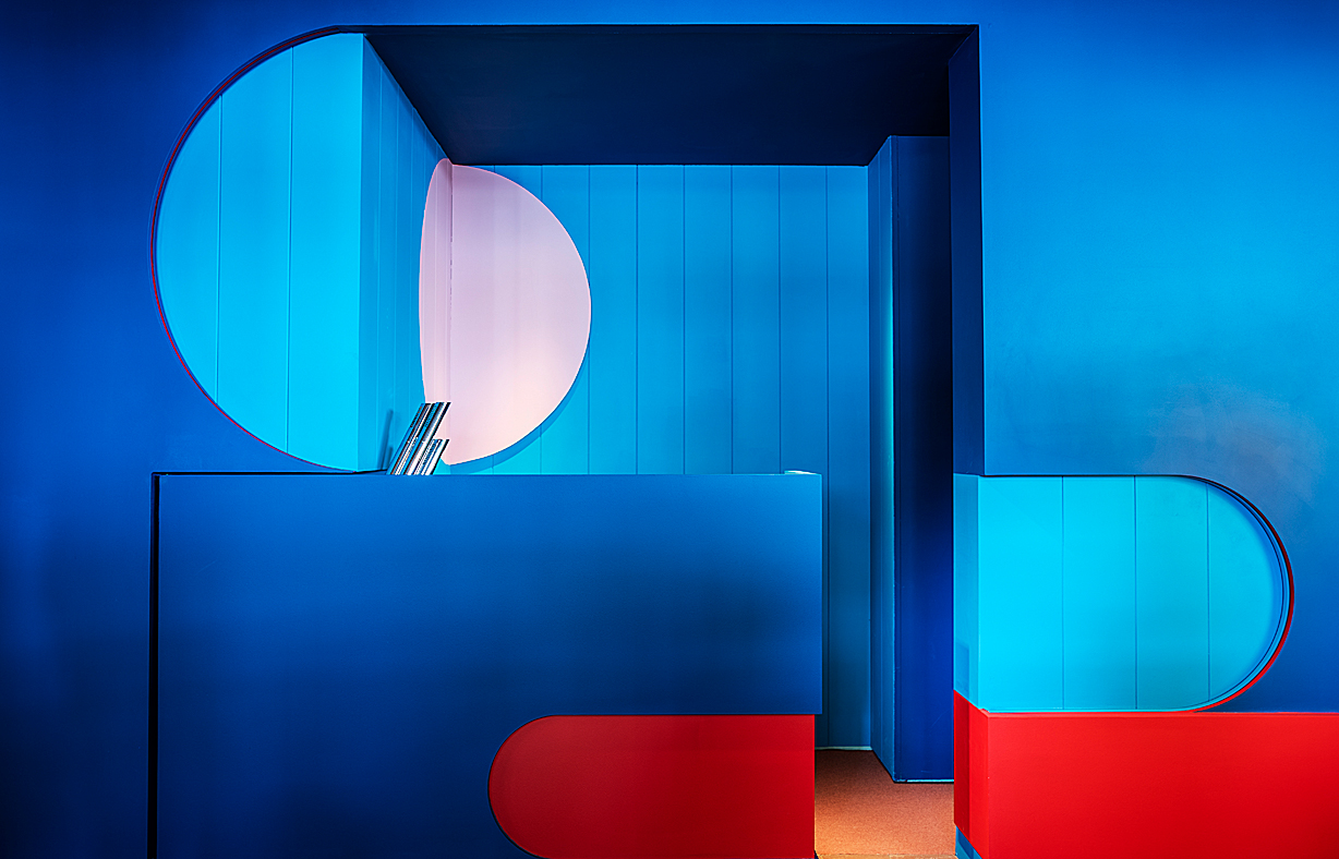
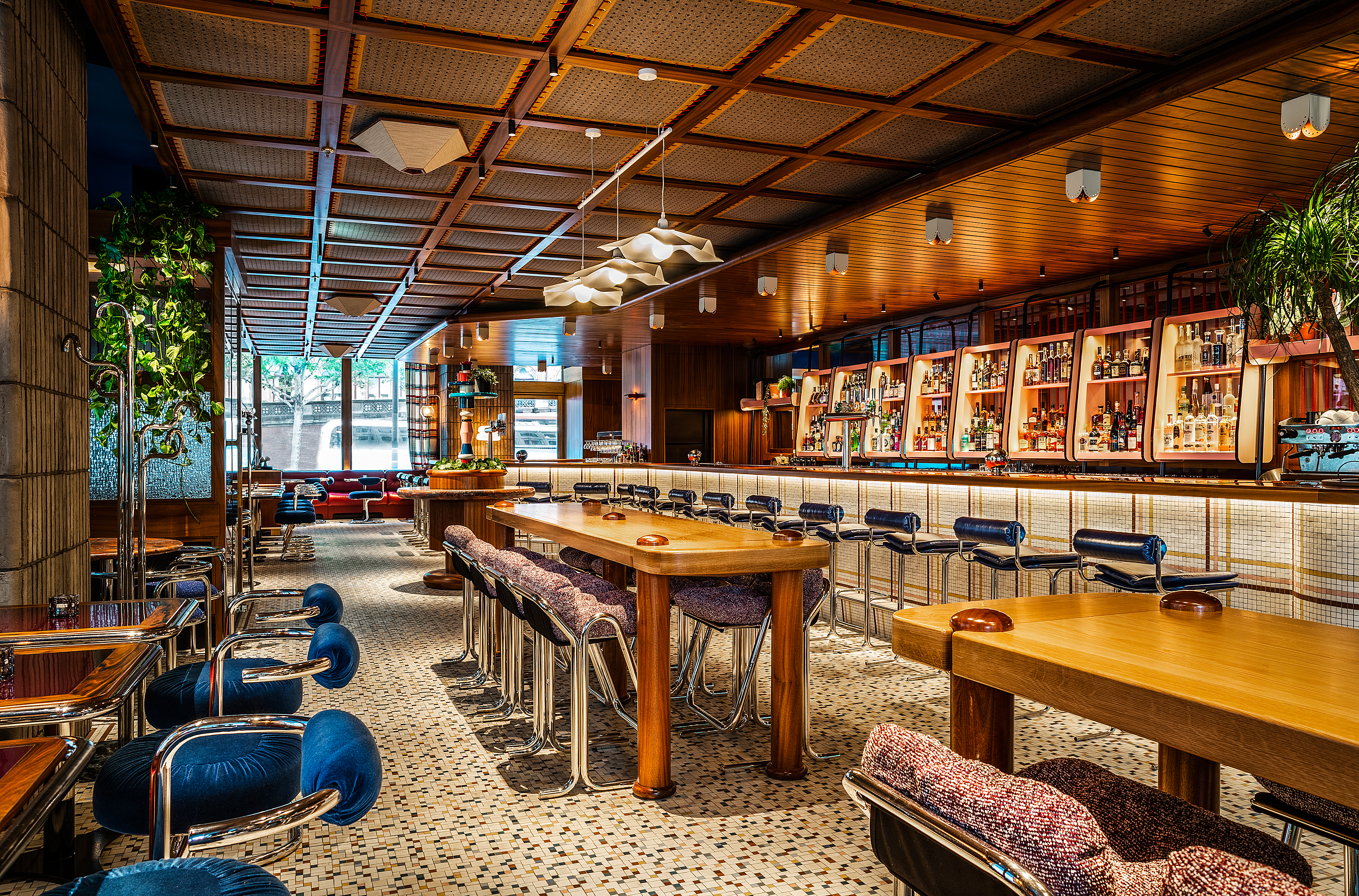
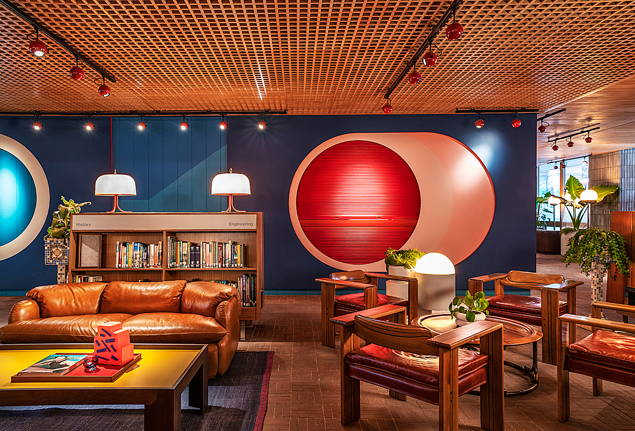
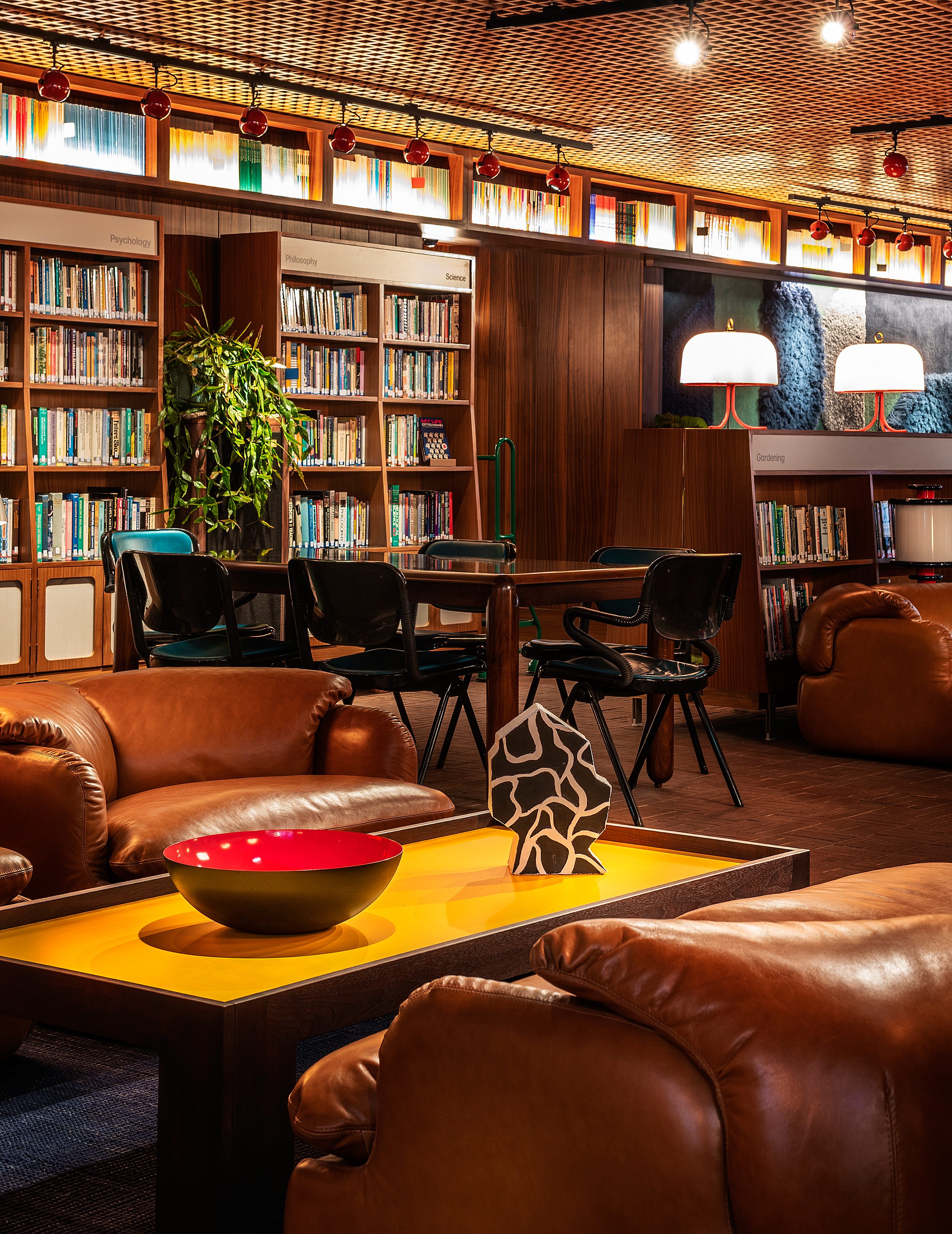
The Brutalist former government building that is now The Standard once housed a public library, and designer Shawn Hausman was determined to ensure that this history was celebrated within the hotel.
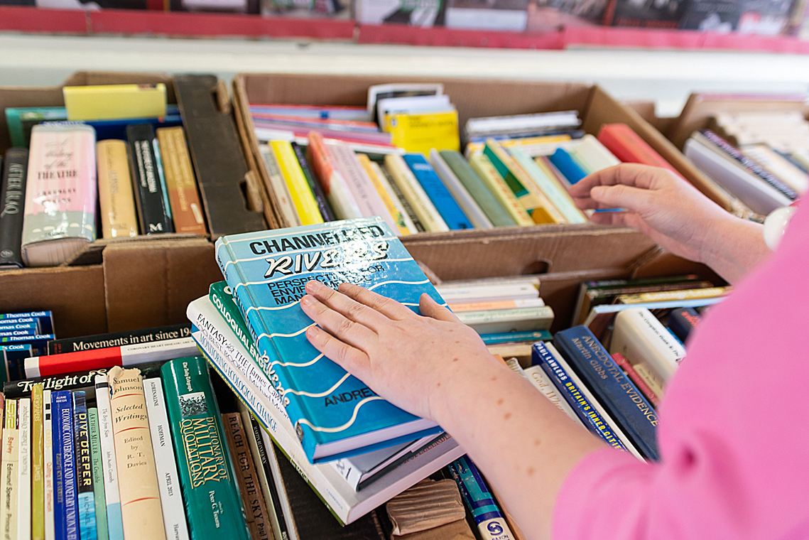
The ground floor bar now houses a library of 1970s and 1980s books, carefully chosen by curator, writer and artist Carrie MacLennan.
Set next to the DJ booth and with plenty of leather Saporiti sofas to sink into, the library stacks have been playfully laid out by MacLennan, with Environmental Science next to Despair; Politics next to Tragedy; and Darkness next to Hope. Here MacLennan tells us why the job made her smile.
How did you find the experience of creating a library for The Standard?
I had the time of my life working on this project. The library is part art project, part playground and part explorable, touchable, readable library – not to mention the backdrop for a programme of cultural events and happenings.
I’m not a professional librarian and neither am I a literary expert but I do love books and magazines and zines – and printed matter, generally. You’ll notice there’s a visual thread across the book covers. I have no problem sniffing out glorious typography, excellent graphic design and sublime/ridiculous photography. I’ve been such a fan of The Standard for a long time. To be able to tell the story of the brand, of this stunning building and the quirks of the human condition through books is a dream scenario.
Can you talk us through the placing of the different genres of books.
There are 65 linear metres of books and 28 different subject categories in the library. The vast majority of titles are non-fiction. At first look, the bookshelves appear to be set up pretty much like a conventional 70s-80s era public library, but look closer and you’ll notice they’re not exactly what they seem.
I compiled a list of nearly 200 potential categories during my research process. To shrink 200 categories to 28 was pretty tricky and I was still finalising categories right up until the last minute. It also became apparent that my sense of humour leans toward the darker, more cynical, deadpan side of life! There was a point where I had to consciously inject a bit of light-heartedness into the categories, reminding myself that this room is a place for people to relax and have fun. I had to make sure that some poor guest wasn’t flanked by categories like Despair, Chaos, Crisis and Heartbreak while trying to enjoy a cocktail.
The categories are paired together very intentionally. Sometimes the pairs interact in some way. Sometimes they make little statements. Sometimes they are just absurd. Romance sits next to Technology in a nod to the nature of modern dating. Mind, Body & Spirit sits next to Business as a reminder that we mustn’t put work ahead of self-care and other kinds of fulfilment 100 per cent of the time. Environmental Science sits next to Despair, Politics next to Tragedy – subtle little messages about our collective circumstances.
Can you give examples of some of the books and their placements that made you chuckle?
The Adult Relationships section is particularly good for this kind of book play. Delia Smith’s One Is Fun! microwave cookbook punctuates, on one side, books about celebrating and exploring sex and sexuality and on the other, coping with relationship breakdowns. There’s a book called How to Solve Conflict in the Library in the Business section that always make me laugh.
Where did you source the books from?
I sourced over half the books in the library from local bookseller Skoob Books. I’ve been allowed into secret basements and warehouses and been left to my own devices to hand pick titles for days on end. I also sourced a portion of the books from other local book stores – Judd Books and Gay Is The Word.
The rest I found by scrolling and scrolling through my favourite online second-hand book store.
Just one book so far has come from Amazon and it was a ‘must have’ rarity about our very own Shawn Hausman so it had to happen.
What do you think of the design of the library and the rest of The Standard?
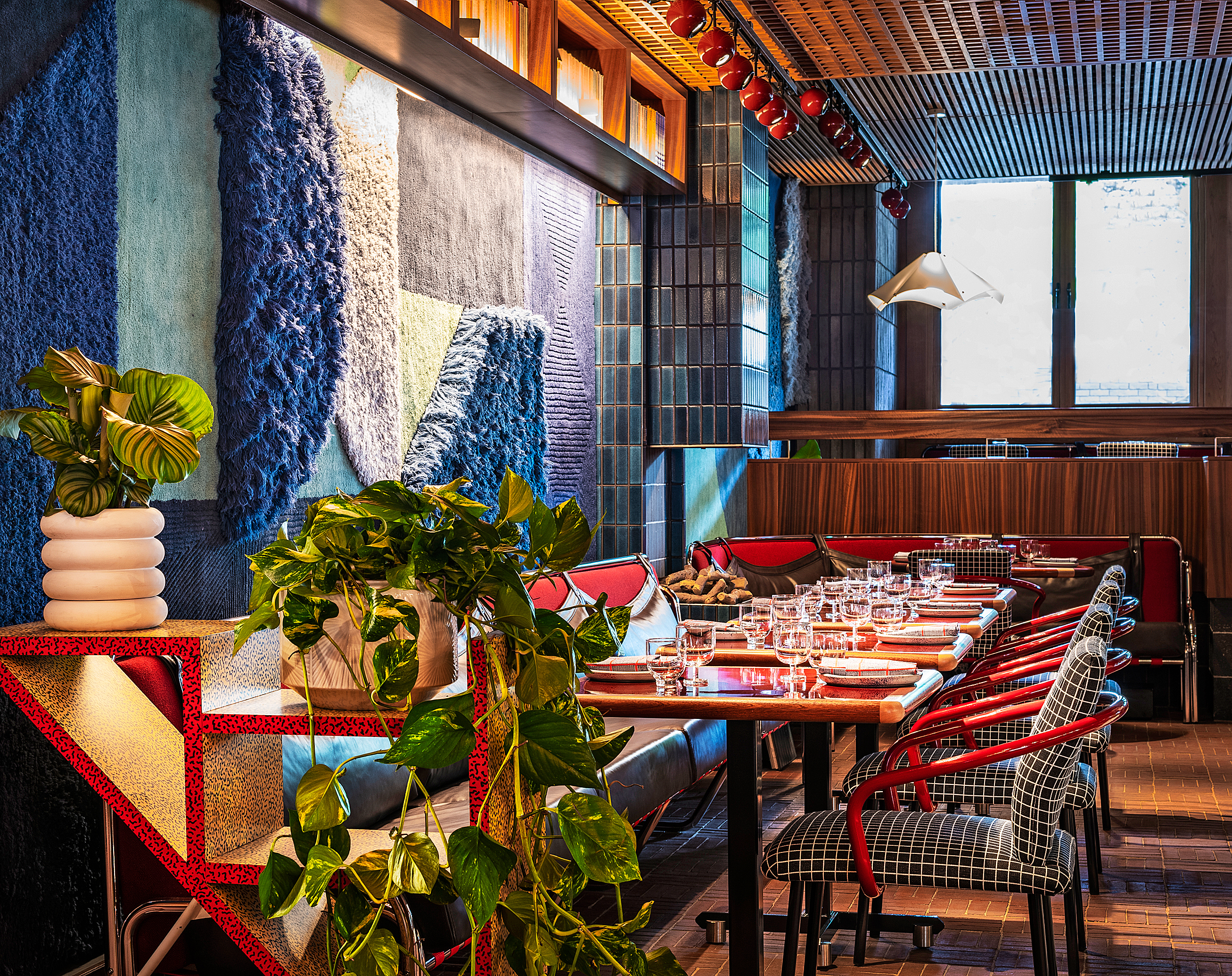
As someone who loves colour clashes and pattern smashes and mixing up textures, The Standard is a delightful assault on my senses. I relish the visual dissonance that’s present in a lot of the spaces. You think you’ve sussed out what’s going on, you think you’re getting to know it and then something – a colour, a texture, a sculpture, a piece of art or an unusual plant, an unexpected pattern – challenges you. I get a real kick out of that. It makes my heart leap.
The library has been carefully curated and laid out by Carrie MacLennan
Photos: Garry MacLennan